
Call to action is everything on your website. Providing all the details, information and so much knowledge is in vain, without specific direction.
Hence, you need to provide a call to action that actually makes people perform the action.
Here are 10 proven tips that are sure to make your call-to-action link perform better with a better conversion rate.

A call to action doesn’t have to be fanciful, poetic or cypher. Be as clear as you could, yet as precise.
CTA needs to action compelling. For that, you need to give your readers a clear action button. Clear CTAs mean -
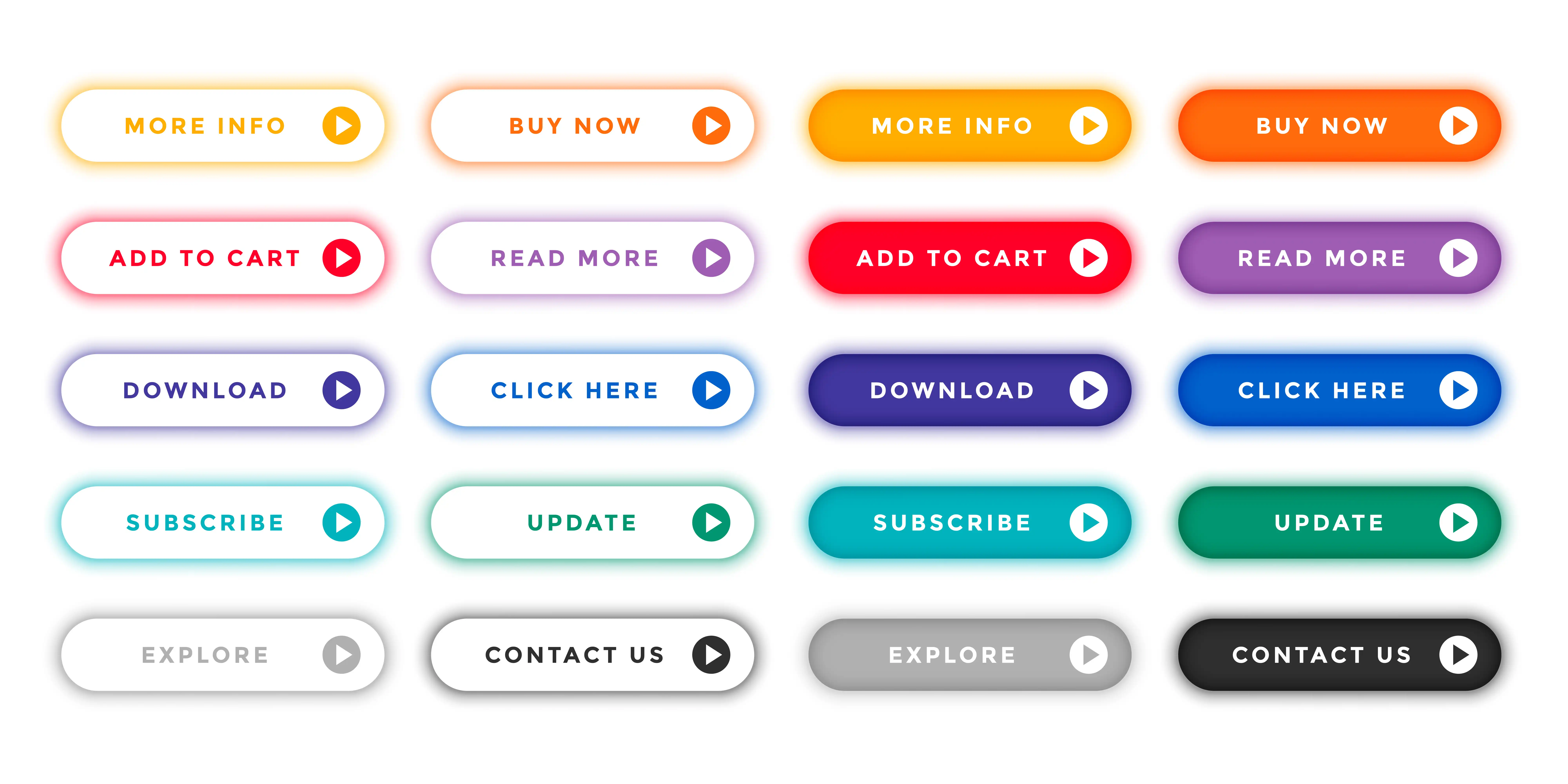
Buy Now,
Add To Cart,
Read More,
Know More,
Learn More,
Explore,
DM us,
Call us,
Buy Here,
Buy Today,
Book Demo,
FREE Demo,
Get You Bonus,
And so on.
All these CTAs are 2-3 words, clearly defining the action that the audience needs to perform.
But are they compelling ones?
Here are a few compelling CTAs examples:
See How
Know How / What / Where
Avail Your Discount
Become our partner
Join our family
See what’s in for you
Recommended for you
Join 1% Club
Get Your Daily Dose Of XXX
So, now you know the difference between clear and compelling CTAs.
By choosing words that are goal-oriented, you convey your message effectively and increase the likelihood of achieving your desired outcomes.
Focus on using strong verbs and avoiding vague or overly complex language.
Action-oriented language is something where probabilities are eliminated. For example, avoid using words like:
Can, will, shall, may, ought to…
Instead, use - the present continuous tense.
Creating a sense of urgency is a powerful tool for driving sales. The time-sensitive language creates this urgency and encourages customers to act quickly.
By emphasizing the scarcity of your product or service, customers are forced to take quick action. Thus making your sales faster.
Usually, items are immediately added to the cart but after a period of time, the cart is abandoned.
Time-sensitive language is:
while supplies last
offer ends in XXX
Autumn/spring offer
Till collection/stock lasts
Early bird discounts
The successful e-commerce websites out there have their buy now button in yellow and add to cart button in orange colour. And you will notice nearly 90% of the eCommerce store has the same colour.
Is it a copycat scenario?
For some, yes.
But pioneers of the forte have run a whole human psychology theory behind this.
As there are action-oriented words, there are action-oriented colours and fonts and sizes too. And even numbers. Hence, your prices should be in accordance with that.
For instance, let your CTA button be brighter and more energetic in colour, vibrant, slightly animated like popping up. Make sure that animation of the call to action shouldn’t be irritating. It should just serve its purpose - attention-grabbing.
Users are more likely to hit your call to action button if it is rightly placed.
If you are having your selling page, make use of your call to action at least 3-4 times.
Once on your menu,
second, when you are making your offer,
third, right after your testimonials,
Last, at the bottom.
Be stubborn and pop up in front right when your visitor is leaving your site.
Enhance the effectiveness of a call-to-action (CTA) with videos and images communicating with them.
Incorporate images or videos that showcase your product or service by illustrating its features and benefits. Visual elements that are consistent with your brand identity help to reinforce your messaging and build brand recognition.
In asking to act, simplicity is key.
Make it simplest and easiest for your audience to complete the action.
Users should understand everything clearly, and precisely and the process should be as easy as single tapping or clicking.
And voila!
Action done already!
Offer a lead magnet.
The lead magnet could be as simple as a free newsletter, daily tips, hacks or anything relevant to your service that solves your target audience’s pain point. Offer the lead magnet for Free, or for the least price that you can afford.
Remember that, a lead magnet is your promotion. So, never mind investing in lead magnets.
So, give your audience more than they are expecting. Add value to your CTA.
A/B testing, or split testing, is a common method for comparing two versions of a CTA to see which one is more successful. It involves randomly directing an equal number of visitors to each version and then measuring the conversion rate for each.
This process can help you identify which elements are most important in motivating your audience to take action and allow you to refine your CTAs accordingly.
By continually iterating and optimizing your CTAs, you can improve the effectiveness of your marketing efforts and drive better results for your business.
Some common optimization techniques include changing the wording, colour, size, placement, and design of the CTA.
It is also important to ensure that your CTA aligns with your overall marketing goals and messaging.
Thus the tips for creating an effective call to action on your website.
With a strategic approach to CTA optimization, you achieve maximum results and drive higher conversion rates.
Let us know which tip you found the most useful among the above-mentioned. If you know something else apart from what’s mentioned, do share it with us in the comments below.
Choose verbs, write in continuos tense, and make your call to action button highlighted.
Paint a picture of dreams fulfilled, where the action is the gateway to wishes distilled. Let your call to action resonate with you audience’s solution that they are seeking for.
Keep a count down clock. Create urgency in time, season or stock.
