
The first impression applies to websites too. And you can never make your first impression twice.
What makes your website a good website? There are several factors that add to the feel of a website.
Website Design determines the overall look, feel user experience, and conversion rates.

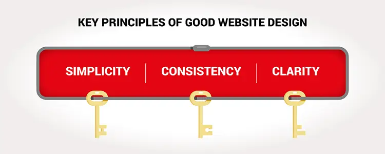
Simplicity is key in web design. It's important to have a clean and simple site layout that does not have too many distractions or anything unnecessary.
Consistency is also very important in web design because it ensures that all elements are in sync with each other, which leads to a more cohesive look and feel.
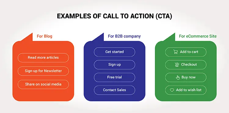
Clarity is also crucial when it comes to web design because you want your site visitors to know where they are going at all times. Give a clear CTA.

There are actually so many factors that contribute to making your website look pretty and engaging. When you land on a website, you immediately form an impression about it. When your visitors come to your website, they form their impression about you which lasts enough to either make or break your business.
So, here’s something that you should consider while designing your website -
Create a vibe with website
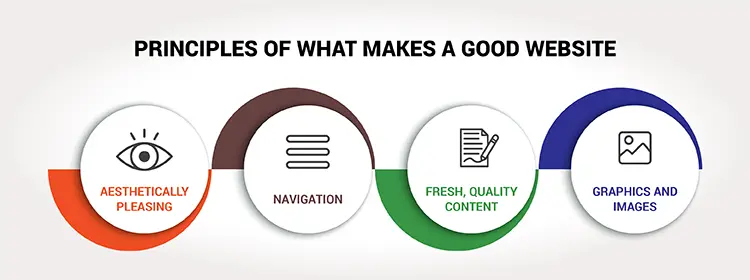
Every business needs a good website, but what makes a good website? Professionalism and aesthetics. This is where you need to spend some time put into your design. The aesthetic design may not seem as important as the content of your website, but it is definitely something you should not overlook.
People are more likely to buy from companies with websites that are visually appealing. There are a lot of things you can do to improve the aesthetics of your website, from choosing a color scheme to adding images and videos to choosing the right typography.
To make your website aesthetically pleasing, every minute detail matters. Even your spaces and font size, letter spacing and every single thing.
Befriend your visitor
A good website design is one that is simple, functional and easy to navigate. Website navigation is the core of any website. It is crucial to have a simple and logical navigation structure so the user can find their way around the website effortlessly.
By easily navigable, we mean, the website should be clean and clear. When a visitor visits your website, he must know where to go and how to go. Most importantly, he must be willing to go. Your landing page of the website has just one purpose to serve - to create desire.
Whatever your website is about, whatever your purpose is, make sure, every visitor leaves as your friend.

Design a website that narrates your goal
Make sure your website is communicating the message clearly. Do not let your visitors drift away.
Whenever a visitor is landing on a website, the least he is seeking is value. And your communication is the value that you are providing him.
Make sure, you are clear with what actions you are expecting your audience to take. This happens with clear communication. Let your audience know your goal, and let them be on your page actually when they are on your page.
Make your visitor want to stay back for a little longer
The thing that attracts and asks your audience to stay longer on your web page, is its cuteness. The prettier it looks, the longer your audience will stay.
They need something that holds them back, right? Make your website look sexier.
Whatever images you are placing on your website, have them in high resolution. At the same time make sure, your website loading time is the lowest. Make it as such lighter, faster and high resolution. That’s the skill of a real web designer.
Serve your purpose
The purpose. Your website is on the web for some or the other purpose, right?
You have some or the targeted audience.
So, what’s that?
It shouldn’t be something secret.
It shouldn’t need n number of scrolls.
It shouldn’t be a riddle.
It should be clear at first glance.
What are you expecting your readers to do?
Are you expecting them to subscribe to your email list, to like you, to share you, to call you, to WhatsApp you, to purchase something from you or do you wish your visitors to come and go simply?
Whatever it is, ask them to perform the action on a clear note.
Ask them with clickable redirection.
Be simple and clear.

Make your visitors welcomed
The website is a modem. Through which you are either imparting a value, building trust, building relationships or selling something.
It is either a platform to communicate, or it is a soft shop for someone.
Make sure, you personify your website.
Unless you are going to make your visitors feel welcome, they aren’t staying with you longer.
Let them know you care for them.
Let them know you know their pain points.
Let them know you exist for them.
Your visitors will bookmark you and share your link with their loved ones when they feel that you are adding some genuine value to their lives.
It happens when you personify your website.
So, what makes a good website design? Which is the website that you liked the most?
